Mad Nice
Hella Cool. Stupid Good. Mad Nice.
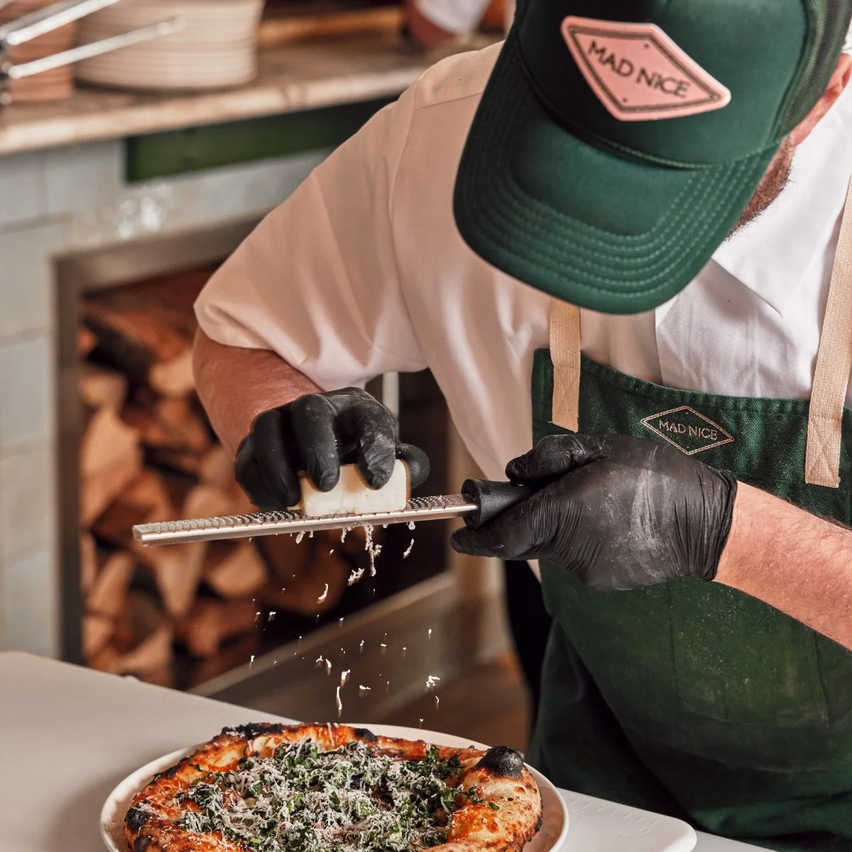
The latest venture from Detroit’s Heirloom Hospitality, Mad Nice, is a modern Italian restaurant with seamless and sophisticated service, offering a menu with elevated coastal, Italy-meets-Californian vibes — all served up with their signature Detroit sauce.
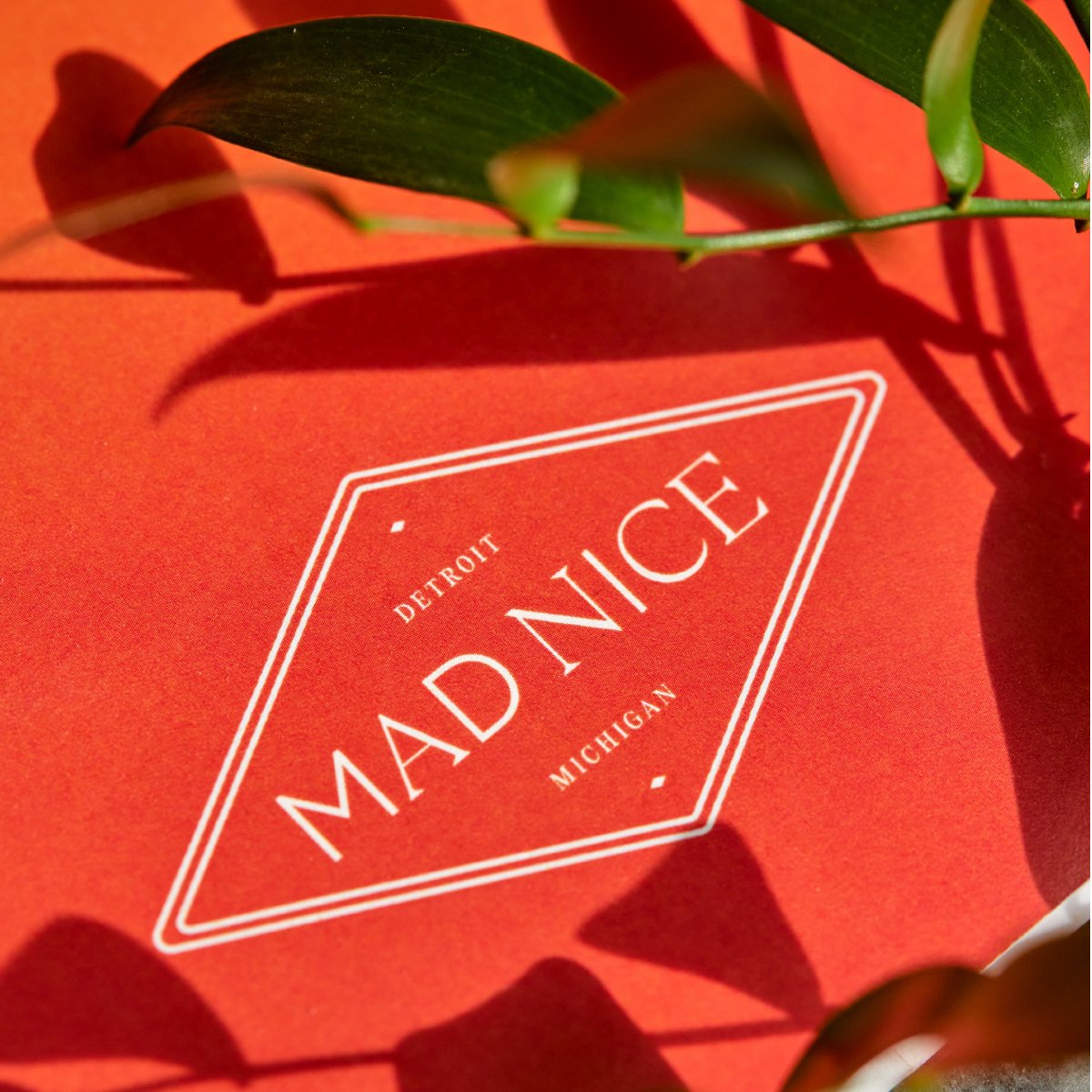
Crown Creative developed the visual identity where new ideas meet timeless classics. The identity plays on both the old and the new, between "mad" and "nice", with contrasting typographic styles. This duality is a source of constant tension within the brand — filling it with energy and intrigue throughout the guest experience.
The look and feel is drawn directly from elements found throughout both coastal California and Italy including: food and drink traditions, architecture, fashion, culture, and the landscapes of each locale. Referencing these elements informed everything from the choice of color to the typographic styling, the decor, as well as all of the Brand's touch points — all intended to evoke a unique and distinctive style for Mad Nice.
SERVICES
Brand Strategy
Branding & Visual Identity
Collateral Design, Roll Out
Signage & Wayfinding
Website Design
Art Direction
PHOTOGRAPHY BY
Linea Photo
Hayden Stinebaugh


